Fireside Chats
Twitter and the Presidency
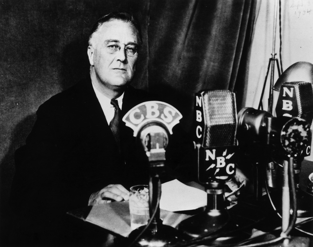
Perhaps analogous to President Franklin D. Roosevelts use of radio for his fireside chats, President Donald J. Trump has established Twitter as his primary communication channel with the American people. By early 2016, his tweets were generating some 10,000 likes and 5,000 retweets a week. Commentators have noted that he uses Twitter to air grievances, use animated rhetoric, and announce new policy decisions. Such use blurs the lines of private and public discourse. The tweets, though, hold all the power of public of discourse as they are often read, verbatim, by news anchors. This dashboard aims to visually show the topics of the President’s tweets and their positive/negative sentiment.
The primary objective of this project is to visualize four topic areas that can be found in the President’s tweets. These four topic areas include policy (economic, global affairs, and immigration), commentary of news sources (trusted news media versus the “fake news”), the FBI investigation into Russia’s tampering with the 2016 election, and partisanship (what he has to say about Democratic politicians and Republican politicians). Custom dictionaries were created for each topic area, which will be used to display the frequency of tweets on each topic as well as the most common words used. These frequencies are further subset by negative/positive sentiment demonstrated in each tweet. Understanding how often the President tweets about certain topics, the sentiment in these tweets, and how this has changed over time will help reveal the communication style of the President and perhaps even provide insight into his changing mindset. The President’s tweets were obtained from the Trump Twitter Archive, which uses Twitter’s API to collect and store tweets. It is the most authoritative database preserving these tweets.